

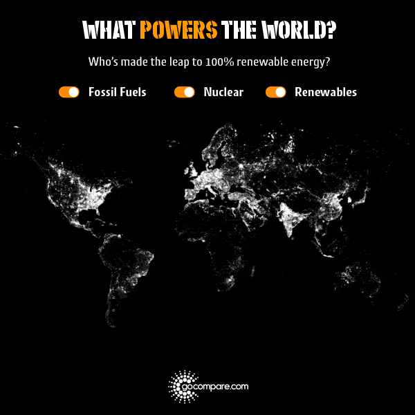
There’s a lot of talk nowadays about moving away from coal, oil, and gas towards renewable energy sources. However, it’s pretty hard to visualize the progress or the potential impact of this switch-over.
So Go Compare, an online British financial comparison service, has created a series of maps that reveal which energy sources power each country, including fossil fuels, renewable energy, and nuclear power.
For example, you can see that areas of the Middle East such as Saudi Arabia, Yemen, Oman, and Jordan are completely dependent on fossil fuels. Countries such as Brazil or Norway, on the other hand, can be seen to have a high percentage of their energy use coming from renewables. France and South Korea also particularly stick out in the three maps with 74 percent and 72 percent, respectively, of their energy being sourced from nuclear power.
You can also check out an interactive version of the map on the Go Compare website, complete with background information on each country’s power sources.

Click image to open interactive version (via Gocompare.com).

Click image to open interactive version (via Gocompare.com).
Click image to open interactive version (via Gocompare.com).


